
In the age of information, we live through an avalanche of various types of data for the most varied of contexts. We produce, process and store an unprecedented volume of data and we currently have more data than ever before. For this reason, the demand for data analytics continues on the rise, as the possible applications are so diverse.
However, what good is all this availability of information if we don’t use that raw data and turn them into an object that either creates value or tells a good story and helps the public make decisions? From that insight, another question arises:
How can we interpret and present those data not only assertively, but also in a visually consistent way?
To help us with that, there are certain design techniques we can apply to data visualization.
There are various types of charts available, and one of the most “sensitive” moments in the data analytics process is deciding how data will be presented. But that is not the most important point—if it either has too many elements or lacks information, even the right chart be hard for people to interpret.
To make a chart more visually effective, we need to apply certain design techniques, such as communication and the Gestalt laws, for example.
Check this article to learn a little more about some of the visual principles of design.
Those techniques involve key principles that describe how the human brain has the ability to understand and interpret a piece of visual communication and find meaning, even where that communication is composed of different individual parts. They are listed below:
- Proximity: Elements that are close together appear to have a directly relationship;
- Similarity: Similar elements tend to appear to belong in the same group;
- Continuity: When elements are lined up or organized in any way, they create the interpretation that they are related;
- Closure: Creating closed groups to establish implicit limit.
So, how do you create a clear and clean chart using visual design techniques?
A “clean” chart is key to visually communicating data in a clear and impactful way. If viewers have to make an effort to understand the story a chart is telling, then we have a ineffective chart.
To generate an assertive visualization, you need to understand what is to be shown and the target audience you want to reach. Once you have that understanding, it gets easier to start creating a data chart in an intuitive format that can be understood more easily and provides clear and useful information. Look at the following comparative chart:
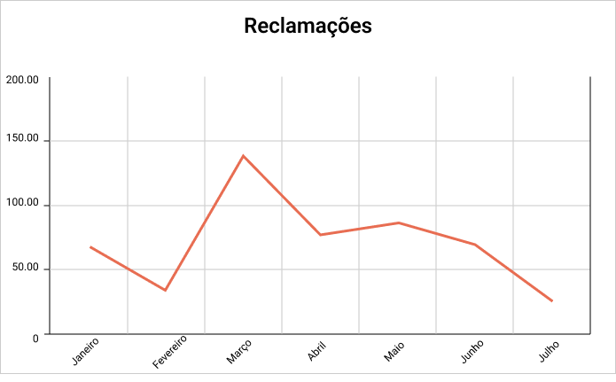
Figura 1
When you look at the elements of the chart in figure 1, you can tell it takes some cognitive effort to interpret the information:
- The graph has may grades;
- The title doesn’t say what it is about and from whom those complaints are;
- The information on the axes is extensive and worthless;
- The color indicates that the data are being shown in a negative context for the company.
By removing some grid lines from the background, selecting more appropriate colors, focusing on the data line and adjusting the texts around the axes in the title, we can create a visually cleaner version:
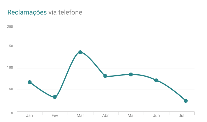
Figura 2
In these examples, it is really important to take the context into consideration, meaning who the target audiences are and what the intent of the chart is by presenting those data. In this case, the author wants to communicate to us that even though in the earlier months there was nearly a month’s period of growing complaints, there has been sustained fall in complaints at their company since just past the month of April.
It is also very important to choose the right colors that are fit for the data being provided. For example, on the chart in figure 1, the color red can convey a sense of negativity or harm, when, in fact, in the context of the chart, the fall in complaints is positive information for the company.
Applying accessibility is key
As we apply design techniques to data visualization, accessibility is paramount, especially because we use colors and subtitles on charts.
For people with visual disability, the information in subtitles can be confused, and without contrast between elements, the chart can become ineffective for the neurally diverse.
Contrast is your best friend
While making reading easier for viewers, contrast helps people with poor sight, among other visual disabilities. It is very important not only to add a white background to your chart, but also to add white spaces to separate the series, as subtitles alone are not always enough. Look at the following examples:
Chart 1 shows us the colors in which data are viewed, with subtitles added to each series.
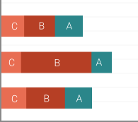
Gráfico 1
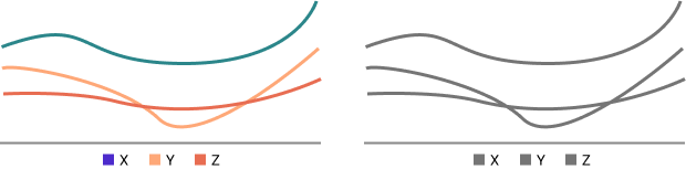
Chart 2, in turn, shows the same information as chart 1, but as viewed by a colorblind person. Note that the series are confused by the colorblind.
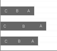
Gráfico 2
To make that chart more accessible, we recommend adding lines to separate the series. That way, the series are easily identified.
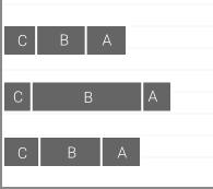 Gráfico 3
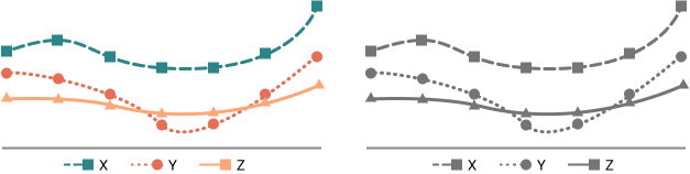
Use geometric shapes in a line chart
In line charts, we recommend using dots to differentiate between series and different shapes, such as polygons, to make up the series.
The first example shows how the series are confused by people with poor sight if no accessibility technique is applied. When geometric shapes and dotted lines are used to differentiate series, the charge becomes more accessible.
Textures are welcome
For pie charts, maps and bar charts, in addition to using white and applying contrast to separate series, using different textures, such as lines, dashes, dotted lines and other aids provides better separation between series and makes the viewing even more accessible to the public.

Color can be your friend or enemy
According to the WCAG, the minimum value required for contrast between colors is 4.5:1. We should also avoid making color combinations like:
– red and green;
– green and brown;
– green and blue;
– blue and gray;
– blue and purple;
– green and gray;
– green and black.
Using contrast-checking tools is a good tip, as they can assist in choosing a good color palette when it comes to accessibility.
Data visualization designer Lisa Charlotte has proposed a color palette that works for the major types of colorblindness. That way, we can use the right colors and make your visualization consistent and accessible.
Describe your visualization
Another very important point is to describe charts, tables or maps. When writing a paragraph, sum up the key piece of information of each data visualization. That can make viewing more accessible to people with poor sight who read the texts “behind” each visual component.
Conclusion
Data transformation is a complex but necessary thing. That is what ensures a detailed macro-visualization of data. With no visualization, it would be impossible to understand and make any decision based on raw data.
Data visualization is not only about using number, metrics and indicators, but also about us deciding the templates and elements we need to use while telling a story, so it is easy to interpret and attractive to all viewers.
Data visualization should also be easy to understand, so even those less familiar with the subject can understand the message being conveyed.
Seeking to understand the story being told by the data and asking what type of chart to use and to what audiences that story is being told is a good way of starting to plot a good chart. Choosing a good design and avoiding very complex elements so as not to confuse viewers in their visual interpretation are also a good practice. When building a chart, we must focus on the important data, eliminating any noises that would divert the viewers’ attention.
Creating a visual hierarchy, applying contrasts and subtitles and describing your charts involve considering not only visual design, but also inclusion and accessibility, and we should always remember that design is by all and for all. When all of these good practices are applied, the story in the data emerges naturally and clearly, creating an effective chart that stimulates any and all viewers to make more assertive decisions.
Bibliographic References
Knaflic, Cole Nussbaumer. Storytelling with Data.
Milani, Alessandra M., P. et al. Data Visualization.
Muzner, T. Visualization Analysis and Design.
Wike, Claus O. Fundamentals of Data Visualization.